Clínica Imperium
[PT]
A Clínica Imperium foi idealizada pelo Dr. Bruno Fonseca, médico nutrólogo especialista em Medicina Integrativa, Emagrecimento, Hipertrofia, TDAH, Longevidade Saudável, entre outras áreas.
Ela surge como um espaço de bem-estar, autocuidado e acolhimento para pessoas que procuram uma vida mais saudável e mais equilibrada.
Seus pilares principais são protocolos de emagrecimento e reeducação alimentar associados ao acompanhamento psicológico e técnicas terapêuticas que trabalham o comportamento de forma integrada, visando a saúde do corpo, da mente e do espírito.
A atmosfera da clínica é acolhedora e humanizada e cada paciente é tratado com carinho e atenção por todos os funcionários.O foco dos tratamentos é na autonomia e no poder de transformação interna dos pacientes, respeitando a individualidade e o histórico de cada um.
[EN]
Clínica imperium was created by Dr. Bruno Fonseca, a nutritionist specialized in Integrative Medicine, Weight Loss, Hypertrophy, ADHD, Healthy Longevity, among other areas.
It comes as a space of well-being, self-care and welcome for people looking for a healthier and more balanced life.
Its main pillars are weight loss and nutritional re-education protocols associated with psychological support and therapeutic techniques that work on behavior in an integrated way, aiming for the health of the body, mind and spirit.
The clinic's atmosphere is welcoming and humanized and each patient is treated with care and attention by all staff. The focus of treatments is on patients' autonomy and power of internal transformation, respecting the individuality and history of each one.

A marca
[PT]
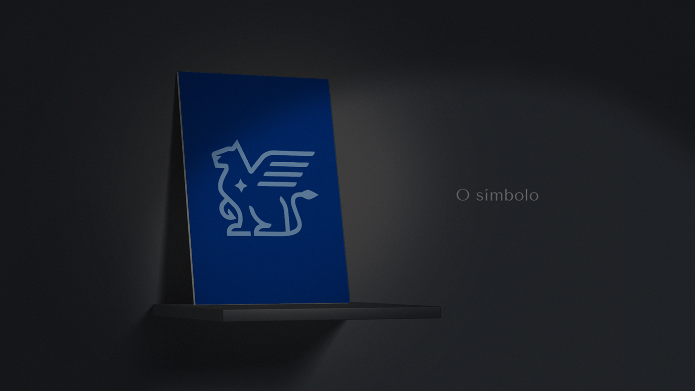
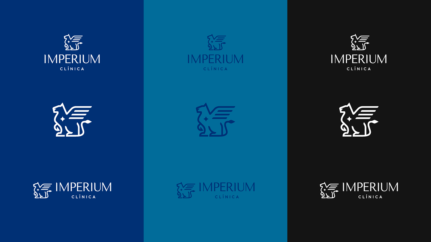
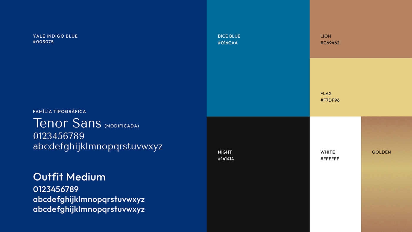
A marca apresentada conta com um símbolo minimalista e bem estruturado que carrega o conceito de força, coragem e sabedoria.
A mitologia por trás do símbolo remete à ideia de Império de uma forma elegante e nada pretensiosa, fugindo dos clichês (coroa, castelo, bandeirolas).
As formas arredondadas tanto no símbolo quanto nas fontes reforçam a sensação de acolhimento e humanização e arrematam a composição de forma delicada, sem perder a força da estrutura proposta.
A fonte principal é marcante e e se faz presente de forma suave e discreta. O detalhe no centro do símbolo remete à individualidade de cada um, à luz e a força que habitam cada ser.A potencialidade de desenvolver autonomia, autoconfiança e autoconhecimento.
[EN]
The brand presented has a minimalist and well-structured symbol that carries the concept of strength, courage and wisdom.
The mythology behind the symbol refers to the idea of Empire in an elegant and non-pretentious way, avoiding clichés (crown, castle, flags).
The rounded shapes in both the symbol and the fonts reinforce the feeling of welcome and humanization and finish off the composition in a delicate way, without losing the strength of the proposed structure.
The main font is striking and is present in a soft and discreet way. The detail at the center of the symbol refers to the individuality of each person, the light and strength that inhabit each being. The potential to develop autonomy, self-confidence and self-knowledge.